Why font choice matters on keepsakes
When a name, date or message is engraved, the font is not only a design detail. It affects how deep the line can be cut, how well the wording reads on a small surface and how the piece ages in day to day handling. On a pendant with only a few millimetres of space, a delicate script may look beautiful but become hard to read. On a larger urn plaque, a clear serif or simple lettering style may carry more dignity and last better in the home.
In our Lynnwood studio, we often see families choosing based on emotion first, then checking the practical side. That is the right order. A font should suit the person being remembered, but it must also work on the material, the size and the intended use. A family collecting a memorial piece in Pretoria or arranging courier delivery nationwide will get better results when the wording and font are confirmed before production starts.
Script fonts for softer, personal wording
Script fonts have flowing strokes and a handwritten feel. They can work well for first names, short messages and occasion wording, especially where the piece is meant to feel intimate. On a jewellery item or a keepsake box, script can bring warmth and a gentle tone. It is often chosen for names, initials and phrases such as Forever Loved or Always With Us.
Script is best used with care. Very thin lettering can lose clarity on small items, and letters that join too tightly may blur if the engraving area is narrow. If the surface curves, as with some pendants or urn caps, a highly ornate script may crowd the edge. A clean script with moderate stroke thickness usually gives a better result.
- Best for short names, initials and small messages
- Works well on gift boxing, cover personalisation and jewellery personalisation
- May need larger spacing on curved surfaces
- Less suitable for very small plaques or long inscriptions
Serif fonts for formal memorial pieces
Serif fonts have small finishing strokes on the letters and are often used for a more classic, formal look. They suit memorial pieces where the message needs to feel steady and respectful. On urn inscriptions and plaques, serif lettering usually stays readable because the shapes are distinct and the spacing is clear. It is a strong choice for full names, dates and longer lines of text.
For many families, serif lettering feels balanced. It can look traditional without becoming fussy, and it holds up well when the item will be seen in changing light, such as near a window or in a display niche. In humid coastal areas, or in homes where the piece may be handled often, clear serif engraving can still be read easily years later.
- Good for urn inscription and plaque personalisation
- Suitable for full names, birth dates and remembrance lines
- Easy to read from a little distance
- Often a safe choice when you are unsure
Simple lettering when clarity is the priority
Simple lettering, sometimes called plain or sans serif, is the most direct choice. It has clean lines and no extra flourishes, which makes it very practical for small surfaces and detailed engraving. If the item has limited space, or the wording includes long surnames, multiple names or a full date line, simple lettering can prevent crowding.
We often recommend this style for family orders where several items must match, such as a set of keepsakes for siblings or cousins. It also suits clients who want a neat finish without drawing attention away from the photograph, material or shape of the item. On jewellery, simple lettering can be easier to read than script once the piece is worn often.
- Ideal for small spaces and long names
- Good for bulk family orders with matching items
- Works well on jewellery and compact plaques
- Useful when the message includes several lines
How to match the font to the item
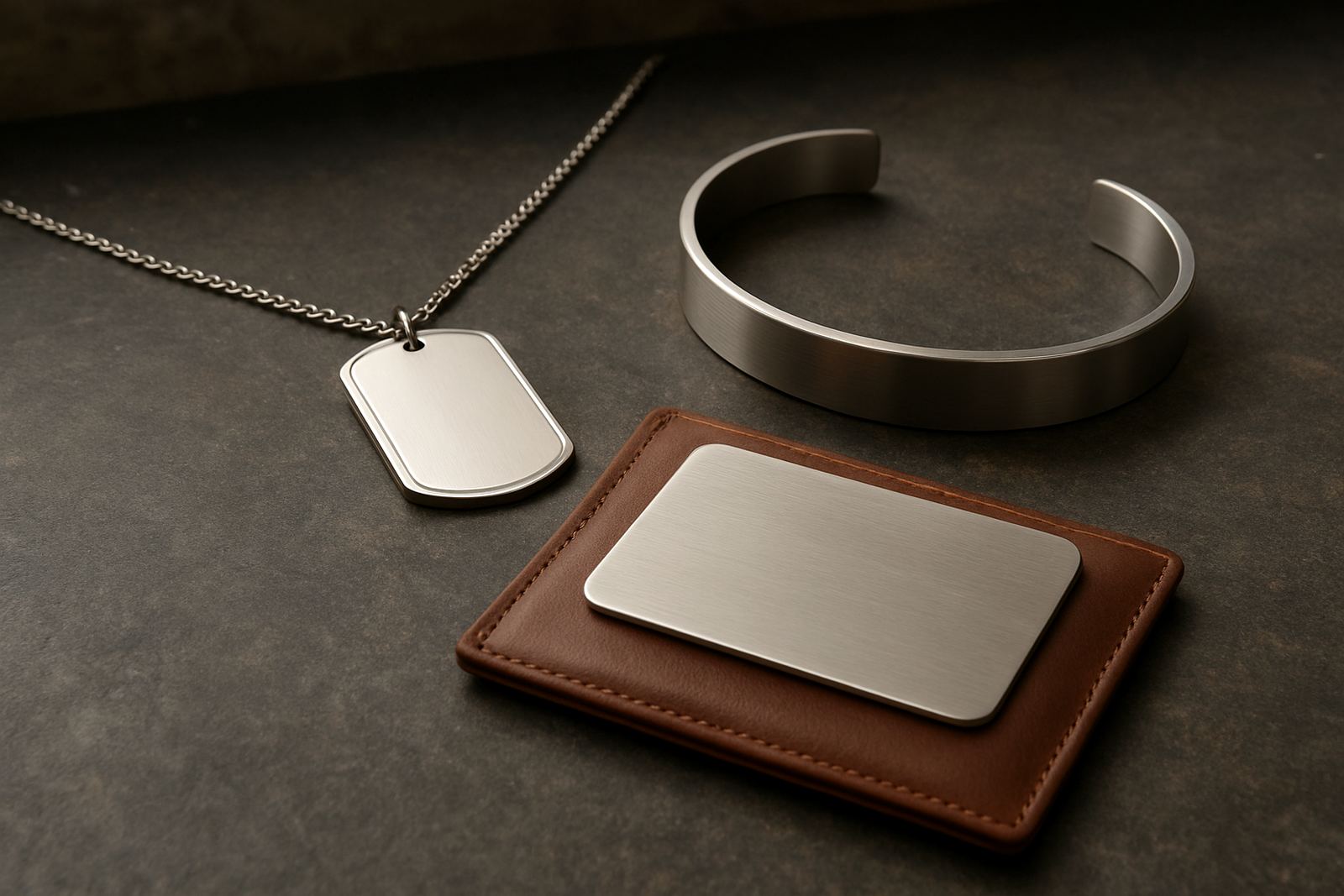
The same font can look very different on a pendant, a plaque or a photo book cover. The size of the item, the material and the surface finish all matter. A polished metal surface may show fine detail clearly, while a matte or textured surface may need bolder lettering. If the piece is curved, the outer letters may need more breathing room so the engraving stays even from end to end.
Our production team checks the wording against the space available before work begins. That matters for names with many letters, double-barrel surnames and longer memorial messages. If you are collecting from Lynnwood, Menlyn, Brooklyn, Centurion, Silverton, Garsfontein, Montana or Midrand, or arranging courier delivery, it helps to confirm the text early so the right font can be set up properly.
- Small items usually need simpler lettering
- Curved surfaces need extra spacing
- Long messages are better in clear serif or simple fonts
- Text should always be checked against the actual engraving area
Proof approval helps prevent lettering mistakes
A font sample or proof is useful before engraving starts. It lets you see how the wording will sit, whether the capital letters look balanced and whether the line breaks make sense. This is especially helpful for memorial wording where even a small spacing issue can change the feel of the piece.
Before approving, read the text slowly and check names, dates, apostrophes and spelling. If the wording includes more than one family member, make sure each line is in the correct order. Our customer care team often finds that a font can look fine on screen but needs a small adjustment once the item size is measured. A quick proof check can save time and avoid disappointment.
- Check spelling, dates and punctuation
- Confirm line breaks and name order
- Look at capital letters and spacing
- Ask for a clearer font if the text feels crowded
A Pretoria example: choosing a font for a memorial keepsake
A family in Pretoria may come to the studio after choosing an urn and a small engraved keepsake for home display. They might want the same wording on both pieces, but the font cannot always be identical. The urn may suit a serif style for the full inscription, while the smaller keepsake may need a simpler version of the same wording so that every letter remains readable. That small decision can make the set feel coordinated without forcing the text into a size it cannot handle.
For local clients, we often suggest testing the message against the item size before deciding on script. If the wording is only a name and date, script may work beautifully. If it is a longer tribute, a simple or serif font usually gives a calmer finish. The aim is to keep the memory close and the lettering clear, not to squeeze too much into too little space.
Font choice is one of the final steps, but it has a lasting effect. Once the piece has been engraved and boxed for collection or couriered across South Africa, the lettering becomes part of the keepsake itself. A thoughtful choice now means the message stays easy to read, easy to share and easy to treasure.